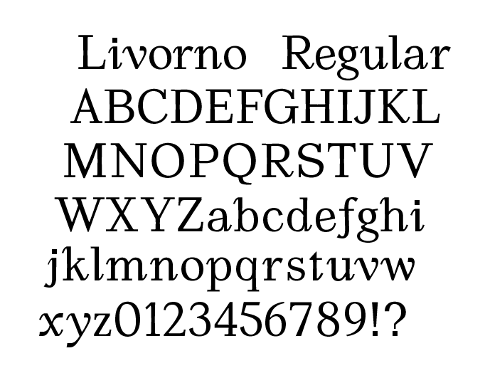
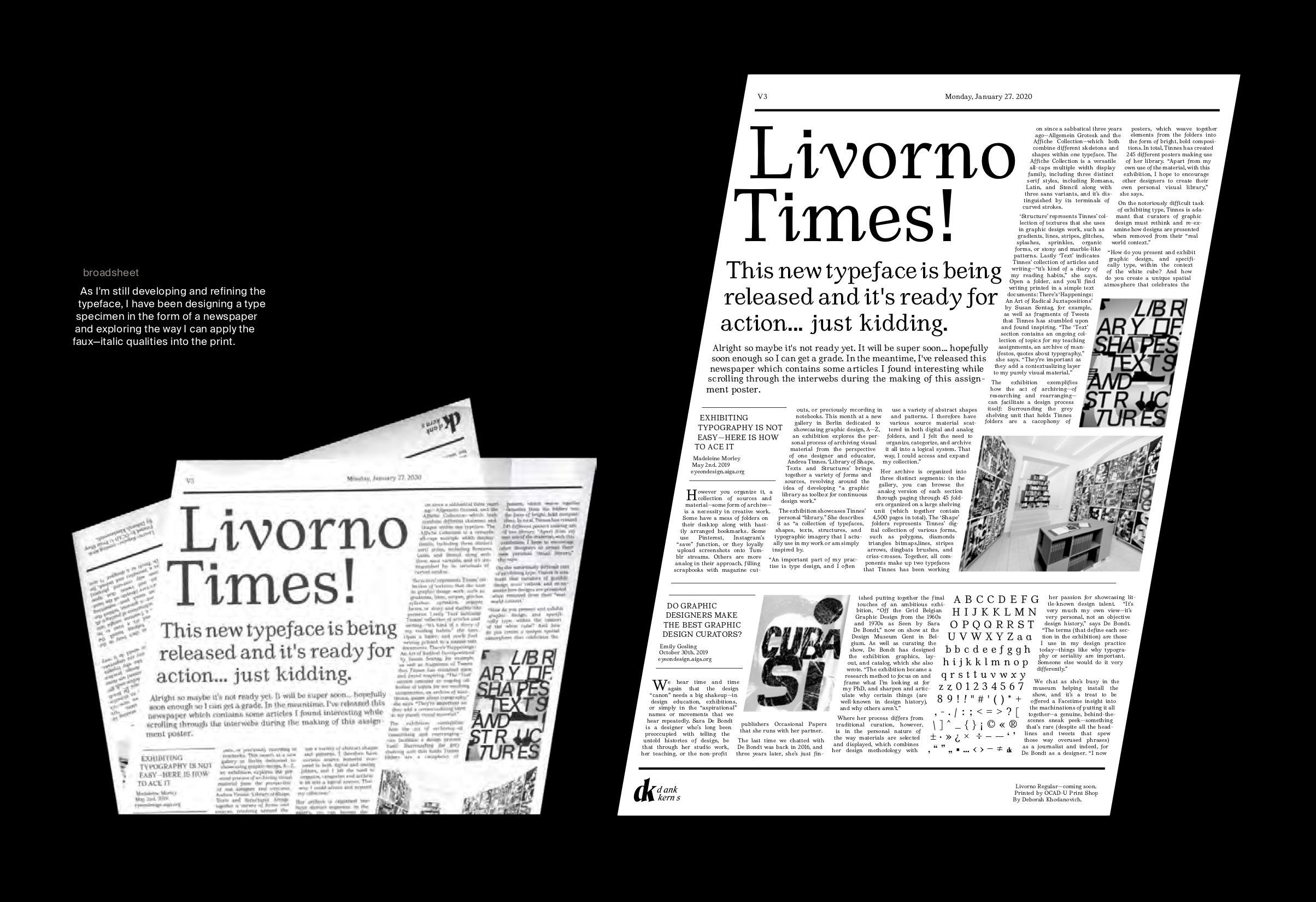
LIVORNO REGULAR
Originally this project started within a typeface design class, and has outwardly progressed to being an ongoing personal project. The inspiration for the typeface was the love I had for curves of characters in italic weights of typefaces, but recognizing the problem of accessibility within using italics for entire body paragraphs.
Italic qualities (such as the descender on the lowercase f) are missing from the regular weight in many typefaces and so I decide to design a mix of the two. Livorno, named after a city just outside of Pisa, does exactly that.