BSCCS
CLUB AM
B4IKU
LIVORNO
SAY IEEEE!
RECESSION GRADS
Projects & Work
BANANA SKIN • CREDIT CARD • SCREEN
A collection of work created by Dutch performative design duo Tereza andVit Ruller, known as The Rodina. In their thesis, Action to Surface, they describe three understandings of surface: the first being a natural surface—banana skin; the second is a passive surface—credit card; the third being more active—screen.
This exhibition showcases the interpretation of these surfaces through printed materials as well as digital work. The exhibit was created in affiliation with Chris Hamamoto's Exhibition Design course. Designed and curated by: Alice Niu, Charles Victor, Deborah Khodanovich, Henry Rivera, and Kevin Lee.


CLUB AM
Club am is a morning dance party pop up that allows any passerbys to join in on the groove before starting their day. Think of it like a replacement coffee! An energy boost! The fun & energetic brand was a project that doesn't just look fun, but was a blast to work on.
The goal of the project was to develop an entire visual identity, including logo& wordmark, promotional video, mockups and facade for a fictional pop up shop of our choice.


BEFORE I KNEW YOU
Erez Zobary is an incredibly talented Toronto singer / songwriter. Her song before i knew you is part of the album july clouds, and this project was designing the cover and promotional motion graphics for the single. The song involved working with the artist and producer to create a vision for the cover and implement it through the practice of embroidery.


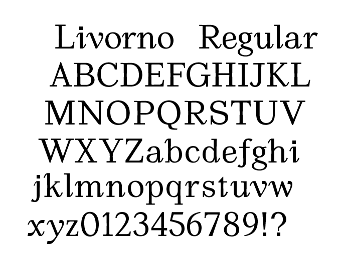
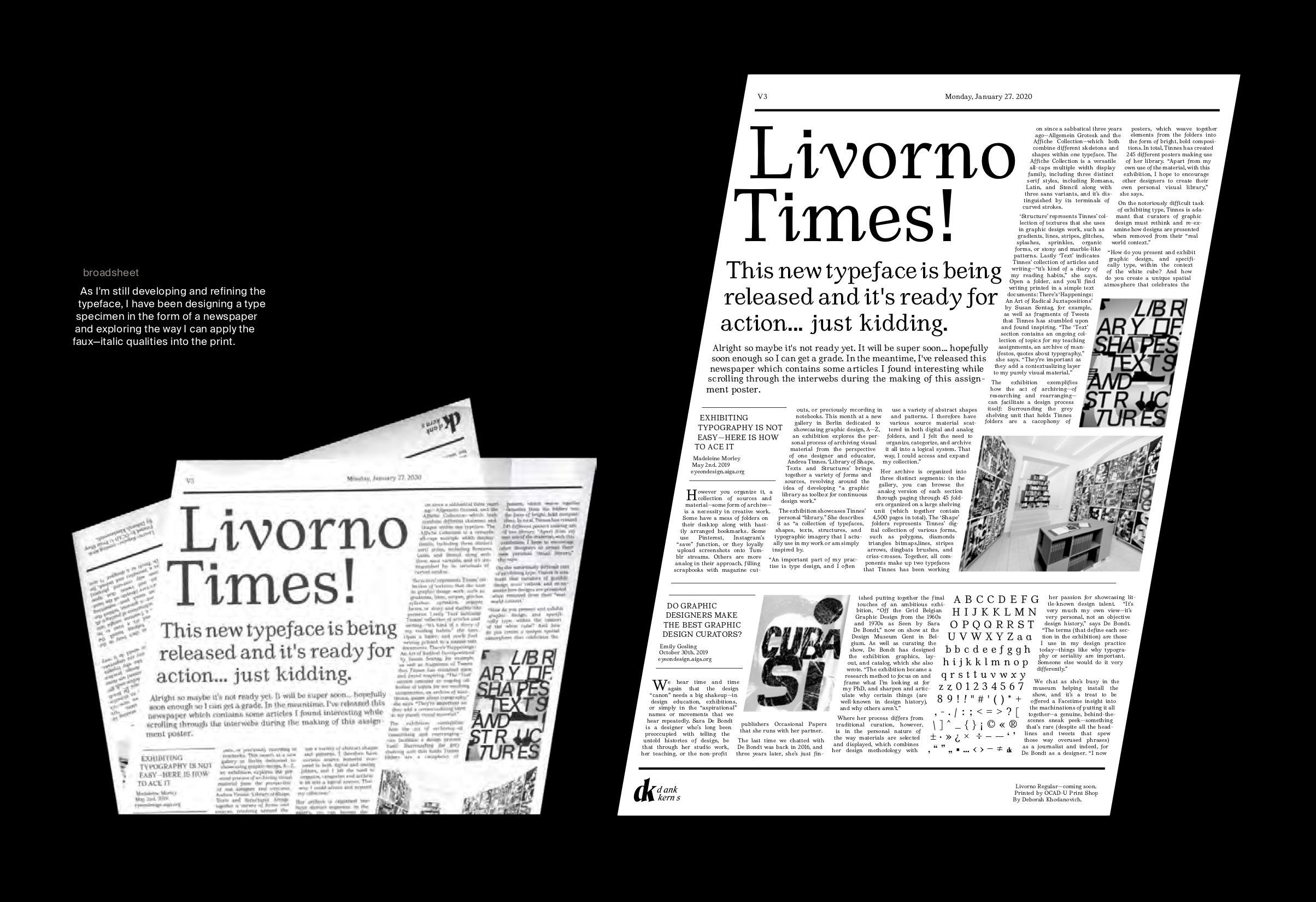
LIVORNO REGULAR
Originally this project started within a typeface design class, and has outwardly progressed to being an ongoing personal project. The inspiration for the typeface was the love I had for curves of characters in italic weights of typefaces, but recognizing the problem of accessibility within using italics for entire body paragraphs.
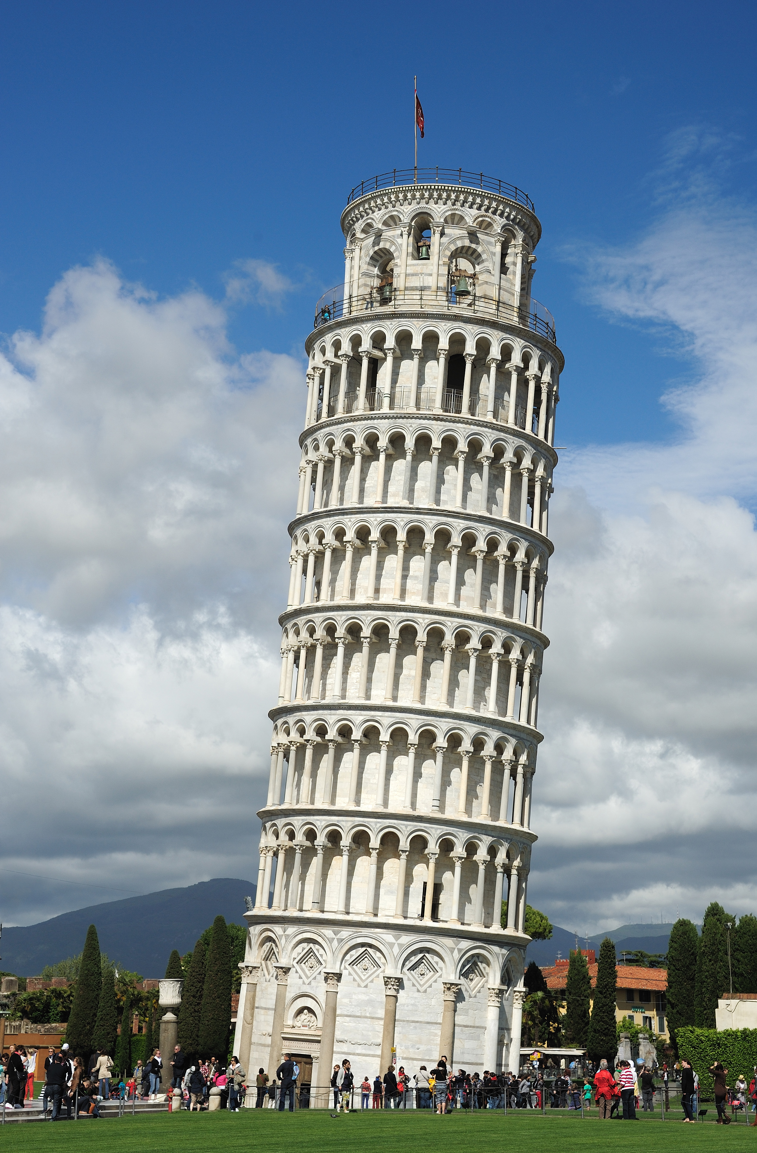
Italic qualities (such as the descender on the lowercase f) are missing from the regular weight in many typefaces and so I decide to design a mix of the two. Livorno, named after a city just outside of Pisa, does exactly that.